For this project, I chose Future as my main concept and went with a futuristic cyberpunk theme for my icons. I chose this design because I adore the cyberpunk esthetic, particularly the futuristic technology, neon colors, and gloomy backdrops.
I wanted the nine icons to have the appearance of being a component of a futuristic digital interface. Teenagers and young adults that enjoy gaming, technology, and cyberpunk media make up the majority of my target audience. I also wanted the hover effects and sounds to make the icons feel more interactive and unify the cyberpunk theme.
SOUND
In order to complement the cyberpunk vibe of my icons, I chose future glitch sounds for the sound effects. I employed a variety of glitches, digital beeps, and electronic effects rather than entirely distinct kinds of sounds. This allowed each icon to have its own sound while maintaining a sense of unity.
I selected these sounds because they give the symbols a more future computer or digital interface feel. In order to keep the noises from feeling entirely arbitrary, I also made an effort to correlate the many variations to the functions of each icon. In general, I believe the glitch effects made the symbols feel more interactive and contributed to the cohesiveness of the cyberpunk motif.
CODING
One of my biggest challenges when I first started creating the website was making all nine icons the proper size and harmonious. I used CSS to scale each icon and change the spacing until everything seemed more balanced because some of them appeared much larger or smaller than others.
The hover animations, which alter and provide some visual feedback when you hover over an icon, were also made with CSS. The buttons kept glitching out, so getting this to function properly was a little irritating. Occasionally, the hover animation wouldn’t function the way I wanted it to, or the icons would shift or resize strangely.
It required a great deal of trial and error, and occasionally correcting one issue might cause another to go wrong. Ultimately, I was able to resolve the coding issues, improve consistency in the scaling, and ensure that all of the hover animations functioned as intended.
ICON DESIGN
To better understand the style I wanted, I initially looked into Cyberpunk 2077’s iconography and interface designs. I drew inspiration for my own ideas from the futuristic features, vibrant colors, and sharp outlines.
After that, I began experimenting with Adobe Illustrator, mostly creating and combining forms with the Shape Tool, Pen Tool, and Pathfinder. To achieve a more futuristic appearance, I experimented with strokes, fills, gradients, and opacity. In order to make symmetrical and circular patterns, I also experimented with Illustrator’s Repeat tools, particularly Radial Repeat and Mirror Repeat. This was primarily an experiment to test if the icons would feel more unified if similar shapes were repeated.
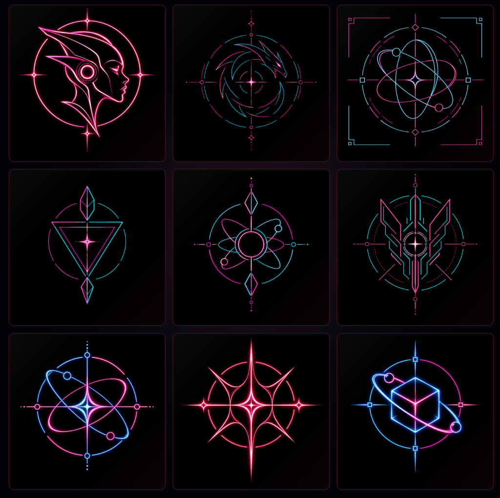
After creating my initial drawings, I used AI to gather input on how to make them better. After that, I returned to Illustrator and made several edits, adjusting the forms, stroke weights, colors, and proportions. To maintain more uniform sizing, I also utilized Align and Transform. After a few iterations, I thought the nine icons suited the same cyberpunk motif and looked much more cohesive.
Process
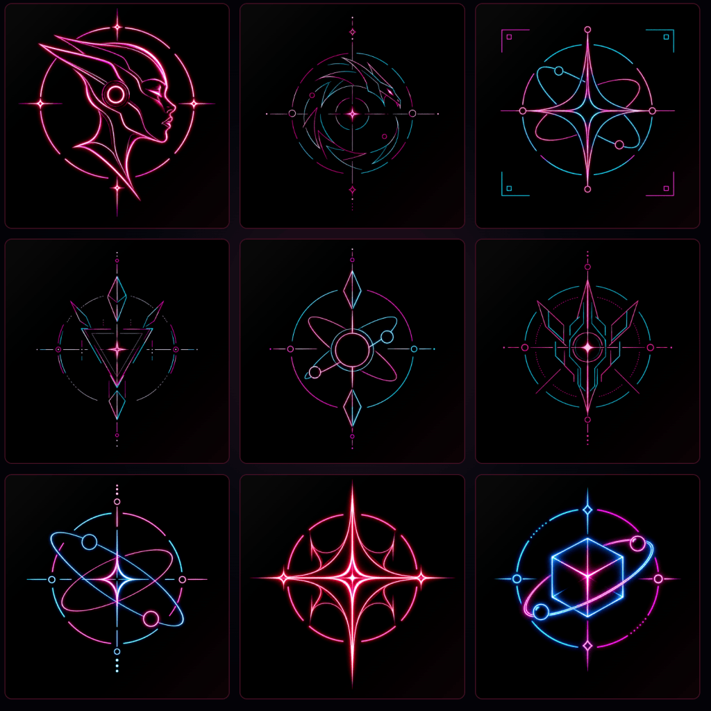
I began creating the nine icons in Adobe Illustrator after selecting the cyberpunk motif. I wanted each icon to be unique while maintaining the appearance of coming from the same futuristic interface. As a result, I continued repeating specific components, such as the four-point star in the center, symmetrical shapes, crisp geometric lines, and circles.
In order to produce the sharper and more intricate shapes, particularly on designs like the dragon, futuristic face, and the more mechanical-looking icons, I used the Pen Tool quite a bit. For the circular backgrounds, planets, targets, and geometric elements, I used Shape Tools like the Ellipse and Rectangle tools. When creating some of the more intricate designs, I also combined and sliced forms using Pathfinder.
Object > Repeat was one of the main things I experimented with. I created symmetrical designs using Mirror Repeat, particularly for the mechanical and triangular icons where both sides had to match. Additionally, I experimented with Radial Repeat for the exterior features and circular patterns. This improved coherence and made it simpler to use the same visual language throughout the nine designs.
In general, the icons can be divided into several categories. Circles and repetitive orbital lines give the planet/orbit and cube designs a more technological and scientific air. The mechanical and triangle symbols are much more symmetrical and crisp, resembling future warning signs or logos. Although the human head and dragon are more illustrative, I used the same bright colors, circular backdrops, and thin line work to make them blend in with the other icons.
In order to regulate the level of intricacy in the drawings, I also employed stroke weight. The majority of the artwork employs brighter or thicker lines for significant portions and thin strokes for lesser elements. A recurring focal point in the majority of the icons was the luminous center star. Since your attention is typically pulled to the bright center before observing all the minor features surrounding it, this also contributed to the creation of visual hierarchy.
Theory of Color
I mostly utilized white, cyan/blue, neon pink/magenta, and black. The neon colors stand out much more on the black background, giving the designs a cyberpunk/nighttime vibe.
Additionally, the pink and cyan complement each other effectively since they produce a striking contrast between warm and cool hues. Whereas cyan/blue conveys a more technological and computerized vibe, pink is more forceful and aggressive. To make the entire collection feel cohesive, I kept going back to these colors rather than giving each icon an entirely new hue.
Additionally, I used white very sparingly, mostly around the brightest spots, like the highlights and core stars. White naturally draws attention to certain regions because it is the brightest color in the patterns. I used more cyan in certain icons and more pink in others. This allowed for some diversity in each icon without detracting from the overall color scheme.
Illustrator and Photoshop
I used Illustrator to create the majority of the artwork and Photoshop for a few last touches. To examine how the neon elements would appear against the black background, I played around with their brightness, contrast, and glow. This assisted me in determining which details could remain more subdued and which areas needed to be brighter.
I also cleaned up and simplified several of the designs between my early and later iterations. When all nine of my initial attempts were put together, the set felt a little disorganized due to the numerous small lines and details. I made an effort to maintain the strongest shapes while improving the consistency of the colors, symmetry, circular framing, and center points.
Overall, I believe that the nine distinct drawings seemed more like one icon set than nine unconnected illustrations because of the mix of symmetry, repetition, consistent line work, and the restricted neon color palette.
Cohesion and Repetition
Using a cross or four-point star as the focal point of nearly every design was one of the primary ways I attempted to make all nine icons feel connected. Despite the fact that each icon had a different subject, I arranged the remaining components around this center point to give them a similar framework.
The shapes of the planet, cube, dragon, and other abstract mechanical motifs, for instance, radiate or circle around the central star. To keep everything centered and symmetrical, I used Illustrator’s Align tools, guidelines, Ellipse Tool, Radial Repeat, and Mirror Repeat.
The robot woman emblem was the sole significant exception. Placing the star in the center would have drawn attention away from her face because it is visible from the side. In order to visually link the star with the rest of the set, I positioned it lower and retained the circular frame, neon line work, and pink/cyan color scheme.
One of the main things that improved coherence and consistency, in my opinion, was repeating the center star. The symbols appear to be part of the same future interface even yet they feature entirely distinct objects, such as a robotic woman, planets, dragons, and geometric forms.


Leave a comment